OUR BLOG
Pantone Fashion Color Report for the Spring of 2016
New York Fashion Week came to a close on September 17th, making it the perfect time to reveal the Pantone Fashion Color Report for the spring of 2016. “Colors this season transport us to a happier, sunnier place where we feel free to express a wittier version of our real selves,”-said the executive director, Leatrice Wiseman, in the article Spring 2016: A Transporting and Transformative Canvas.
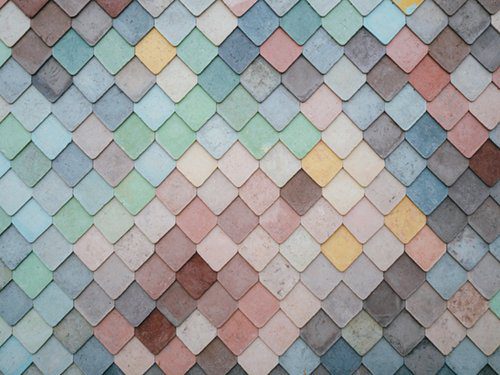
This pantone palette encourages people to disconnect from technology and observe more calming colors such as Peach Echo, Serenity, and Lilac Gray. The use of natural colors encourages the wearers to find relaxation while exploring their curiosities. This color line is unique because it merges vibrant colors with classic and natural tones. The 2016 spring season focuses on playfulness, happiness, and relaxation by refusing to get caught up in specific genders and cultures. Here are brief descriptions of each color in this unisex and transcendent color line:
Rose Quartz:
This color is comparable to a flushed cheek or sunset that exudes a sense of composure and compassion. Rose Quartz reminds us to take a moment from each busy day and embrace our surroundings. The serene budding of flowers and warm sun felt from the spring to summer months is embodied in this calming and tranquil color.

Peach Echo:
Orange can be an intimidating color for many people regardless of their skin tone or hair color. Peach Echo takes the vibrant coral shades mixed with the energetic orange shades to evoke the playfulness of the Spring season.

Serenity:
As the name suggests, this color brings forth a calming mix of blues that feel airy and weightless among the normal shades of blue. This color reminds us of the sky which naturally refers to a sense of space and relaxation.

Snorkel Blue:
The name proposes a color that is adventurous and loves a good escape. More energetic than it’s navy counterpart, Snorkel Blue encourages happiness and energy while reminding you of your favorite tropical vacation.

Buttercup:
While most of the other colors provide a sense of calmness, Pantone needed a color that offered a contras, and this is that color. Bright, sunny, and of course happy is what Buttercup embodies.

Limpet Shell:
This color can be found in the tropical rainforest among waterfalls and crisp clear waters. Part of the green family, Limpet Shell evokes a freshness and cleanness that will make you feel tranquil and modern at the same time.

Lilac Gray:
This shade is usually considered a basic staple for fashion, but this spring is anything other than that. Lilac Gray is the perfect combination of edgy and classic while giving the wearer the ability to work it into their everyday wardrobe.

Fiesta:
The Spanish word for party is a great way to describe this color. Reds are usually harsh and eye-catching but this shade is able to be fiery and high-energy without people having to divert their eyes. Like Buttercup, this shade is a necessary contrast in this Pantone line.

Iced Coffee:
This energy-filled drink takes many people through the spring and summer, however it is a perfect neutral tone to wear as well. It’s soft and earthy coloring makes it an irresistible match for tons of outfit combinations.

Green Flash:
Exploration and escape come to mind when you see this color green. Green Flash pushes the envelope and offers an open feel while still working well with the other colors of the palette.

For a complete list and more details on the colors list above, please visit: